Up your Landing Page Game.
Learn from these pros with the landing page awards...
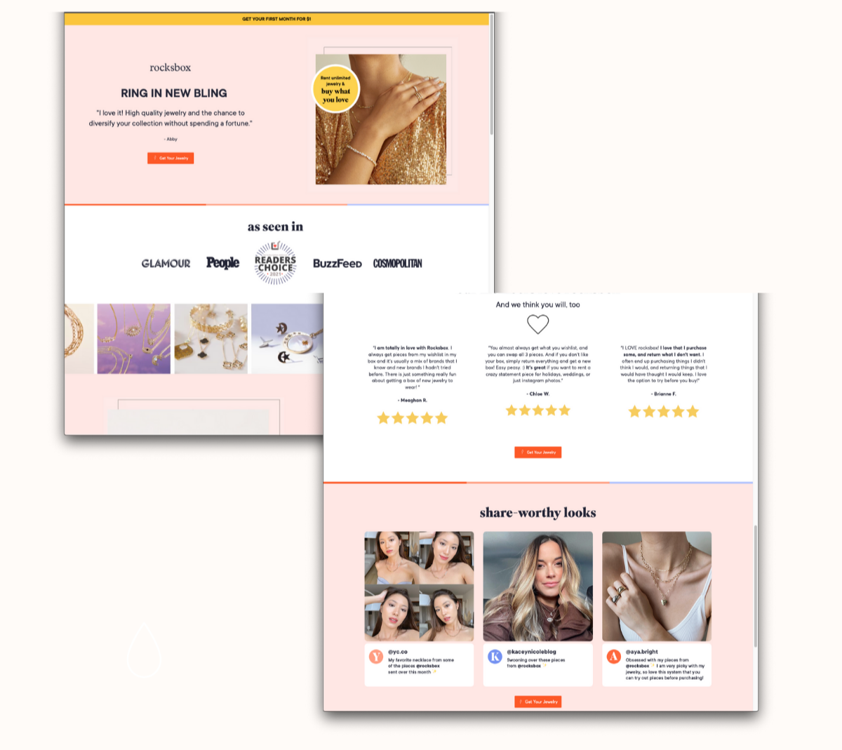
FIRST UP, we give Rocksbox the UGC front and center award. We're sure they'd like to thank their fans, reviewers and content creators for this achievement. The page is simple and the first block is dedicated to a review. Just a scroll away you'll see even more reviews with bolded key points and some visual UGC and captions to support their product's credibility.
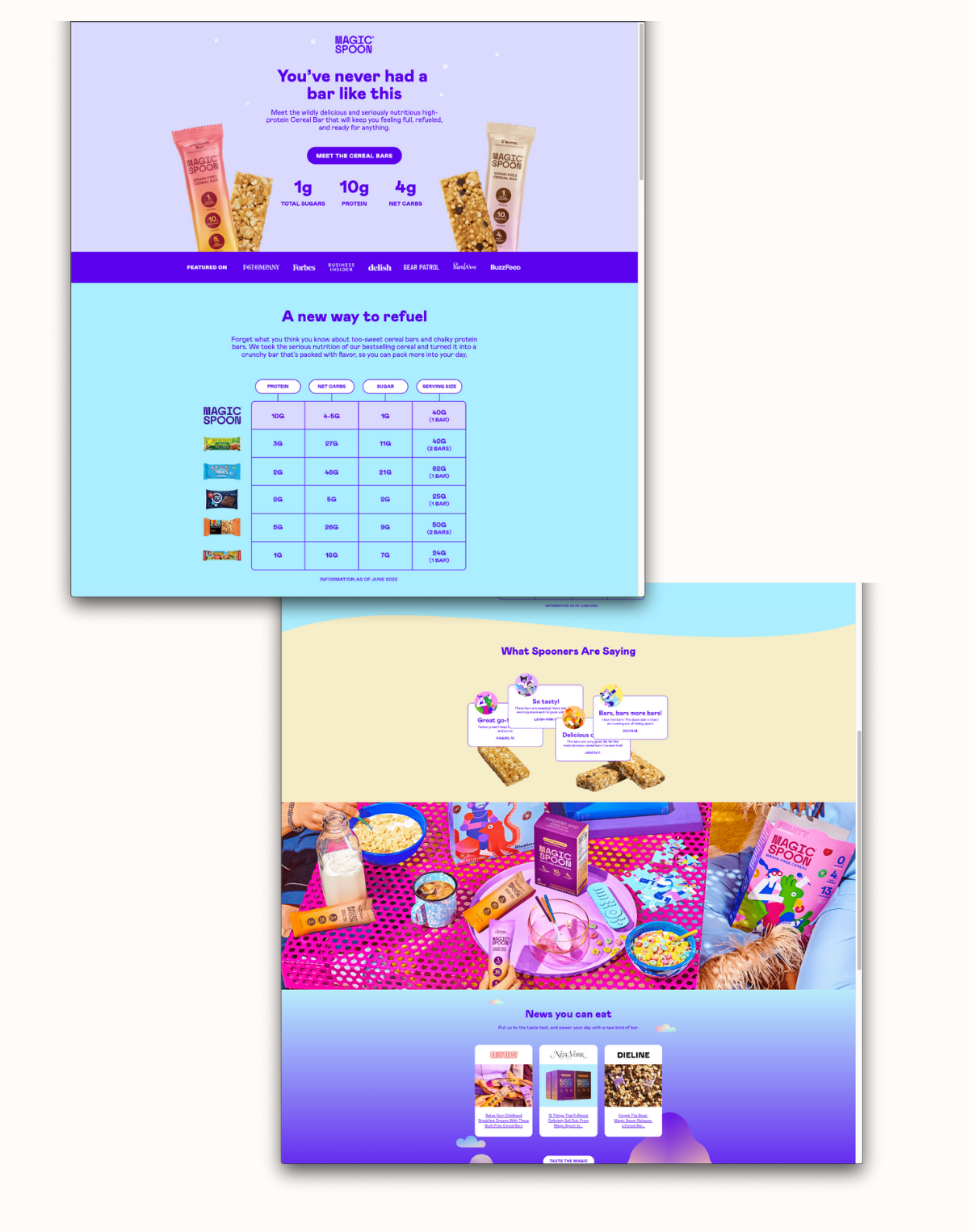
If you're launching anything new take note from this Magic Spoon page. (https://get.magicspoon.com/new-bars-launch/f.html) We give them the WOWZA award! When introducing a new SKU or initiative, having a dedicated landing or lead gen page can increase the customer's experience and avoid more questions or confusion. Also, whoever wrote the copy deserves a raise. Sometimes if a product has just gone to market it's less likely that you are fully stocked with lots of organic photo/video UGC yet, but they did well with their studio shots, product comparisons, written reviews and ended off with more credibility and call to actions.
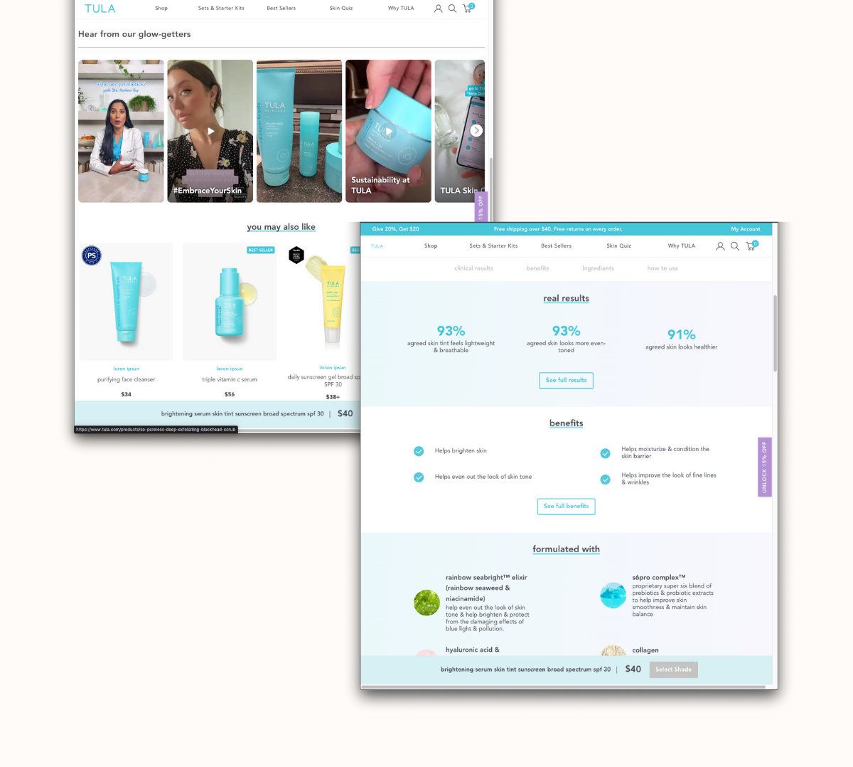
Drumroll for our next recipient. We give TULA the video star award this screenshot is from a product specific page. It had all the info we need from benefits, usage instructions, reviews on reviews, and even a curated selection of videos that you can hover over to play. Notice how the videos look relatable and not "too perfect", and they still hit on the core messaging points they'd like communicated.
Ok, one more. We couldn't not show.
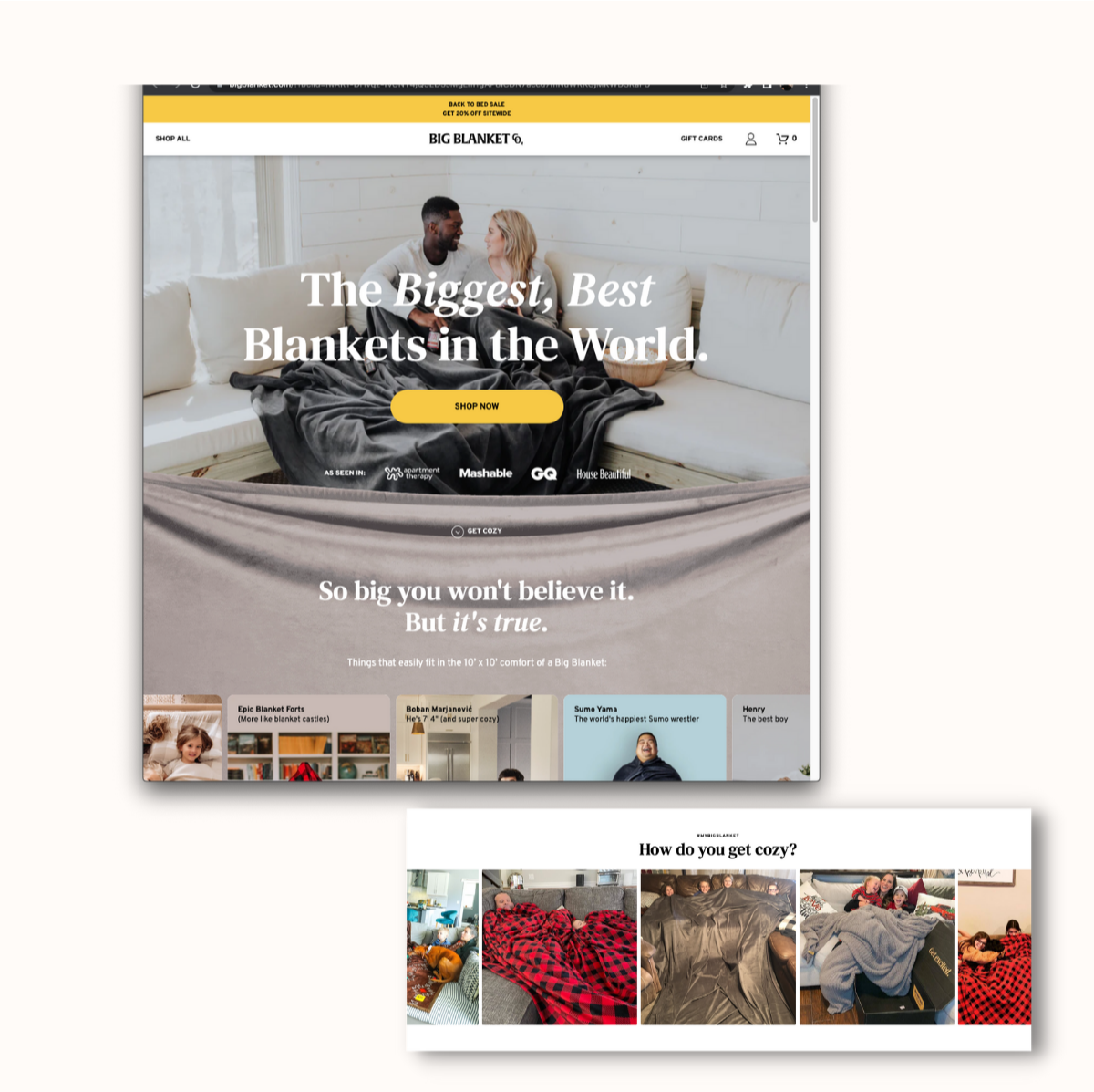
We'd like to present the BIG IMPACT award to none other than Big Blanket. (https://bigblanket.com/?fbclid=IwAR1-DHvqz-fvUNT4jQ5ED5JMgLm1gAP8ICDN7accu7mNuWRKGjMKWD3RaFU) You'll have to click and explore this one for yourself but scrolling the site really shows that extra large cozy blanket feel.
So now that we've broken down some stellar landing pages let's learn from the pros and uplevel your current landing pages with these tips.
Today we're talking quick and actionable best practices and small tweaks to keep in mind if you want to step into Q4 or plan for a 2023 site revamp confidently.
Signs your website is doing its job.
See how many boxes your site is currently ticking.
✅ Your content is clear And scannable. An easy to understand website will always win over a flashy confusing messy copy one.
✅ It's designed for smartphone use When was the last time you tested your sites different mobile views and prioritized accessibility.
✅ Your social links are visible And up to date. If you've worked hard on a new brand TikTok. Showcase those works of art!
✅ Your images make sense We've all seen those sites with cheesy out of place stock photos that actually hinder how credible the site looks. Don't be that website.
✅ Your CTA is thriving How have your clicks been? Time to shake things up? You should place your CTA button where it would get noticed in under 3 seconds.
✅ SEO is on your radar Technology is getting smarter and websites with pages clearly made with AI copy or appear to be created and optimized solely for SEO vs those that help a reader or website visitor are actually being ranked LOWER! Also consider internal linking (yup, even within your own website) "Internal linking is very important when it comes to proving your credibility to search engines. When you link to other pages and elements on your website, search engines get a better idea of your site structure and reward the effort."
✅ It's functional So your website is cute? cool. Now does it work? Are you seeing conversion? Getting compliments for the main goal you set when creating your online shop, blog, store locator, landing page or contact form?